
קובץ:2017- Donald Trump veracity - composite graph.png

לקובץ המקורי (2,775 × 1,750 פיקסלים, גודל הקובץ: 141 ק"ב, סוג MIME: image/png)
| זהו קובץ שמקורו במיזם ויקישיתוף. תיאורו בדף תיאור הקובץ המקורי (בעברית) מוצג למטה. |

|
יש ליצור מחדש את התמונה graph הזו באמצעות גרפיקה וקטורית כדוגמת קובץ SVG. לפעולה זו מספר יתרונות, כפי שניתן לקרוא (באנגלית) בדף Commons:Media for cleanup. אם ברשותכם קובץ SVG, אנא העלו אותו. לאחר מכן, החליפו תבנית זו בתבנית
{{vector version available|שם הקובץ.svg}} |
תקציר
| תיאור |
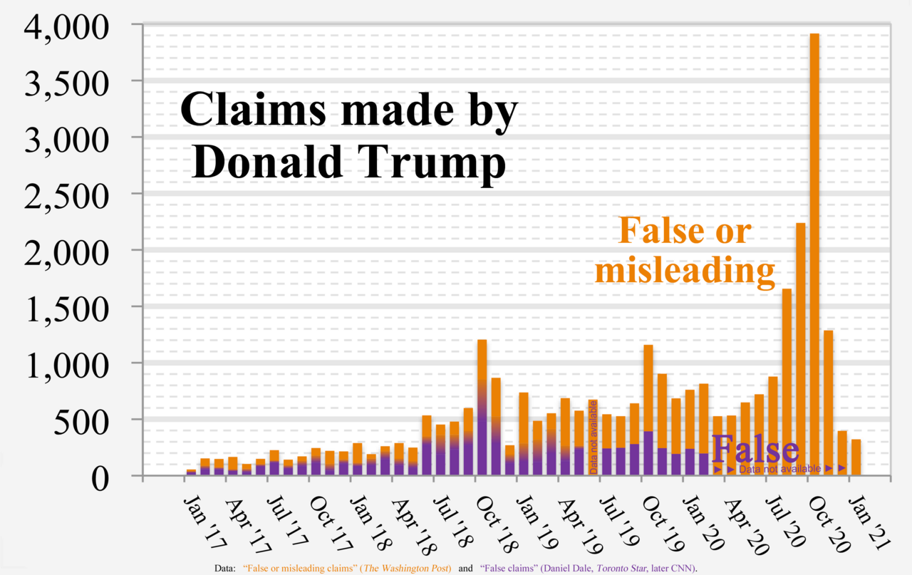
English: Chart of Donald Trump's “False or misleading claims” (The Washington Post) and “False claims” by Daniel Dale (Toronto Star, later CNN)
Technical details:
|
| תאריך יצירה | |
| מקור | נוצר על־ידי מעלה היצירה |
| יוצר | RCraig09 |
| גרסאות אחרות |
 |
Source data
- Data used to form fact check from The Washington Post is in image description page for File:2017- Donald Trump - graph - false or misleading claims.png
- Data used to form Toronto Star / CNN graph is in collapsible text:
- Versions 1 through 4:
| Click at right to show/hide data for Toronto Star / CNN portions (center of "error bars" in Versions 1-4) |
|---|
|
Month False statements |
- Version 5+:
| Click at right to show/hide data for Toronto Star / CNN portions (below, inside, and above Gradient regions in Version 5) |
|---|
|
Each three of the following data items are "stacked" (violet, below gradient, below orange) to form a full-height column. Month MIN GRADIENT WashPost |
רישיון
- הנכם רשאים:
- לשתף – להעתיק, להפיץ ולהעביר את העבודה
- לערבב בין עבודות – להתאים את העבודה
- תחת התנאים הבאים:
- ייחוס – יש לתת ייחוס הולם, לתת קישור לרישיון, ולציין אם נעשו שינויים. אפשר לעשות את זה בכל צורה סבירה, אבל לא בשום צורה שמשתמע ממנה שמעניק הרישיון תומך בך או בשימוש שלך.
- שיתוף זהה – אם תיצרו רמיקס, תשנו, או תבנו על החומר, חובה עליכם להפיץ את התרומות שלך לפי תנאי רישיון זהה או תואם למקור.
היסטוריית הקובץ
ניתן ללחוץ על תאריך/שעה כדי לראות את הקובץ כפי שנראה באותו זמן.
| תאריך/שעה | תמונה ממוזערת | ממדים | משתמש | הערה | |
|---|---|---|---|---|---|
| נוכחית | 09:23, 9 בפברואר 2021 | | 1,750 × 2,775 (141 ק"ב) | RCraig09 | Version 16: Eliminate Oct 2016 as irrelevant date to include. Reduced filesize at tinypng.com |
| 09:08, 9 בפברואר 2021 |  | 1,750 × 2,775 (140 ק"ב) | RCraig09 | Version 15: Update to include final data for January 2021. Reduced filesize at tinypng.com. | |
| 10:00, 16 בינואר 2021 |  | 1,750 × 2,775 (520 ק"ב) | RCraig09 | Version 14: Update to include Washington Post data for Nov and Dec 2020 | |
| 02:32, 6 בינואר 2021 |  | 1,750 × 2,775 (588 ק"ב) | RCraig09 | Version 13: Updated to include Washington Post data through October 2020. | |
| 02:39, 21 בדצמבר 2020 |  | 1,750 × 2,775 (495 ק"ב) | RCraig09 | Version 12: Update to include Washington Post data through end of September 2020. | |
| 10:24, 16 בנובמבר 2020 |  | 1,750 × 2,775 (532 ק"ב) | RCraig09 | Version 11: Updating graph to include exact value for August 2020 that no longer involves extrapolation for the last four days of the month. Washington Post added a few more days to their database. | |
| 01:28, 22 באוקטובר 2020 |  | 1,750 × 2,775 (532 ק"ב) | RCraig09 | Version 10: Update to include Washington Post data for July and August 2020. Had to expand vertical scale to accommodate new high in data value (for August 2020). | |
| 09:43, 13 ביולי 2020 |  | 1,750 × 2,775 (522 ק"ב) | RCraig09 | Version 9: updated to include Washington Post data for June 2020. | |
| 09:00, 5 ביוני 2020 |  | 1,750 × 2,775 (515 ק"ב) | RCraig09 | Version 8: Updating to include Washington Post data for April and May 2020 | |
| 23:29, 15 באפריל 2020 |  | 1,750 × 2,775 (586 ק"ב) | RCraig09 | Version 7: updated to include CNN data for Jan and Feb 2020 |
שימוש בקובץ
הדפים הבאים משתמשים בקובץ הזה:
שימוש גלובלי בקובץ
אתרי הוויקי השונים הבאים משתמשים בקובץ זה:
- שימוש באתר ca.wikipedia.org
- שימוש באתר en.wikipedia.org
- שימוש באתר hy.wikipedia.org
- שימוש באתר id.wikipedia.org
- שימוש באתר ja.wikipedia.org
- שימוש באתר pfl.wikipedia.org